Elite Clubs National League Rebrand
Athletics
Glen Allen, VA
After its inception, the ECNL quickly rose to national prominence – and ultimately to the top level of competition and player development in the country. Now reaching over ten years in the market, the ECNL partnered with Hyperquake to evolve their brand in a way that lived up to its Elite name and positioned their business for continuous growth and recognition beyond the soccer world. Developing a brand that spans time began by uncovering the standard of excellence within the organization, from the staff to member clubs, to players.
Our discovery process revealed that the source of their success comes from maintaining a perfectly balanced culture of complementary ideals: competition and humility, freedom and community, exclusivity, and accessibility. This insight was the foundation of how to show up uniquely in the well-established and highly competitive realm of club sports and organizations, specifically club soccer.


Recognizing the flaws and gaps in American youth soccer, the ECNL did what was said couldn’t be done; curated the highest level of competition in a league run by clubs, for clubs through freedom and collaboration.
The league’s continuous innovation in competition structure, programming, education, and opportunity created a need to reevaluate its architecture.
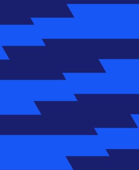
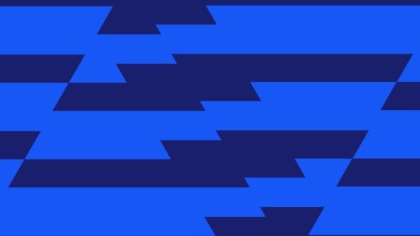
Each color palette was chosen with all the intentionality we recognized within the ECNL. The parent color palette (Composure, Field Vision, Sideline Chalk, and Copa) speaks to common traits of great players, as well as the structure and history of soccer. The girls (Goal Side and PK) and boys (Set Piece and Counter Attack) palettes each have two primary colors, one representing poise and the other intensity.
The colors and their corresponding names are a reflection of the ECNL’s balanced culture, inspired by the nature of the beautiful game.